
About the Client
Zero is the world’s most popular intermittent fasting app. With 700K+ website visitors, 2.5M+ app downloads, and 35M+ fasts completed, Zero is a leading name in digital health. Backed by Greycroft, with Dr. Peter Attia as CMO, and featured in Joe Rogan Experience, Men’s Health, and Fortune.


The Challenge
The Zero team came to us with a tight deadline: they wanted a new website ready for the new year. Their existing WordPress site was outdated, misaligned with the current app branding, and filled with scattered calls to action like “Take the Quiz” that weren’t built to convert. With 700K+ website visitors, the opportunity cost of a low-converting site was significant.
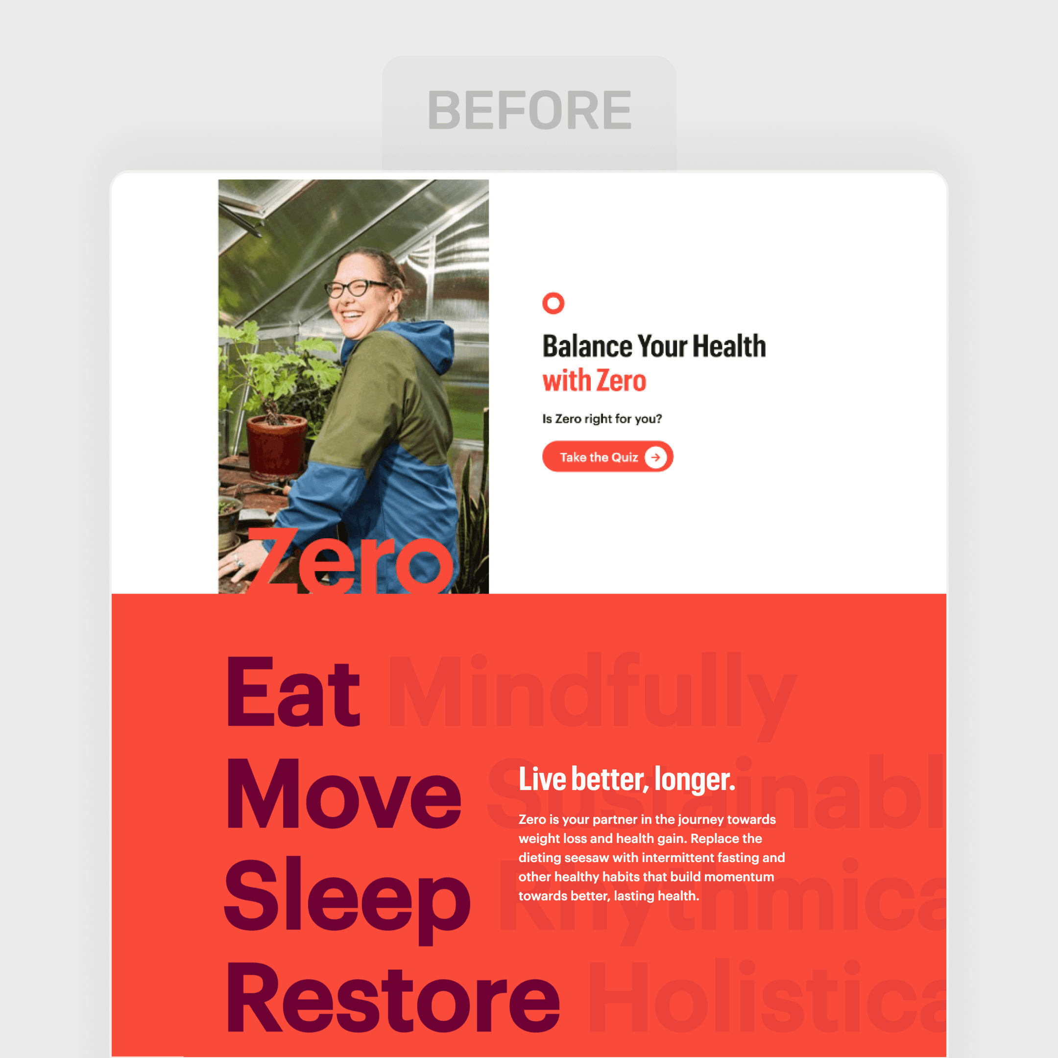
The old homepage showed the gap. The hero paired a lifestyle photo with the headline “Balance Your Health with Zero,” a question, “Is Zero right for you?”, and one button: Take the Quiz. Below it, a red block stacked Eat, Move, Sleep and Restore under “Live better, longer.” Fasting, the thing Zero is known for, came up once, in a paragraph of body copy. The app itself didn’t appear. A visitor who knew Zero from a podcast had to work out alone that the next step was a download.
In Mike’s words, the job came with “a tight timeline with limited direction,” so we started with decisions, not a spec: what the page says first, what proof sits next to it, and where every section leads.
The Solution
We took ownership of the project and designed and built a clean, modern website in Framer, fully aligned with Zero’s current app design and brand identity. The new site focused on clarity, a clear visual hierarchy, and prominent download CTAs that made the next step obvious for every visitor.
Zero’s marketing pages moved from WordPress to Framer with the redesign, while the blog stayed on WordPress behind a proxy. If you’re weighing the same move, here’s how a WordPress to Framer migration works.
The calls that shaped the homepage:
Say the category first. The headline claims it outright: the #1 fasting and protein app.
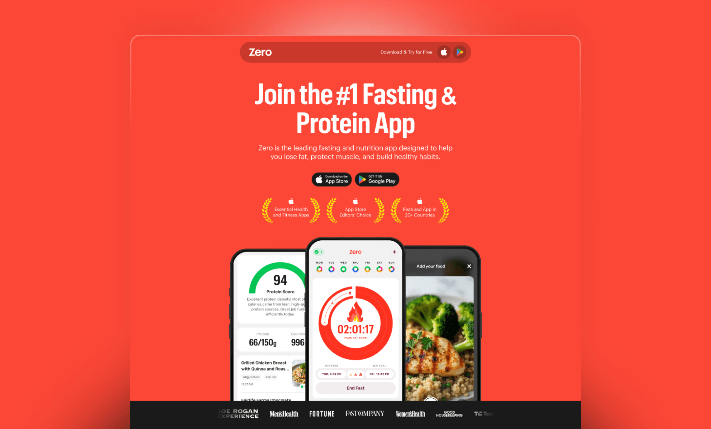
Put the download where the eye lands. App Store and Google Play buttons sit directly under the headline, and the navigation bar carries “Download & Try for Free” with both store icons. The quiz is out of the hero.
Stack the proof near the buttons. Three App Store recognitions sit right under them (Essential Health and Fitness Apps, App Store Editors’ Choice, Featured App in 20+ Countries), and a press bar with Joe Rogan Experience, Men’s Health, Fortune, Fast Company and more follows the app screens.
Show the real product. Three phone screens from the app replace the lifestyle photo: the fasting timer in the middle, the protein score and food logging on either side. Further down, “Master your fasting” sits next to the screen it describes.
Match the app. The hero uses the same red as the app’s fasting timer, so site and app feel like one product.
We also helped Zero’s in-house designer get up to speed on Framer, so someone on Zero’s side knows how the site is built.
The Results
The redesigned site launched on time for the new year. Conversion improved immediately thanks to design clarity and a simplified user journey, with clear, visible download buttons replacing the previously fragmented CTAs.
zerolongevity.com marketing pages on Framer by the new-year deadline, blog still on WordPress
Download buttons in the navigation and the hero, where the old site led with a quiz
App Store recognition, press logos and real app screens in the first scroll, where the old site had a lifestyle photo
Mike closed his review with “We’re already planning to hire him again for future work.” They did.
Beyond the Launch
The partnership didn’t end at launch. When a later AI-powered SEO audit surfaced technical findings, we handled the full sweep: structured data across Zero’s hybrid Framer + WordPress stack, alt text, branded og:images, and page titles. The audit came in April 2026. The hard part was the hybrid stack: sitemaps, canonicals and site identity have to match across both halves, or Google reads two different websites. Framer also changes pages without a full reload, so a cleanup script makes each page drop the previous page’s schema before adding its own. Every schema went in switched off so Zero’s engineer could review it page by page, and the result validated at 0 errors and 0 warnings across six pages in Google’s schema validator, all without pulling Zero’s engineering team off their own work.
Oggie completely redesigned our website for Zero using Framer on a tight timeline with limited direction. He’s highly skilled with modern web design tools, has a great eye for detail, and was easy to communicate with throughout the project. He helped our designer get up to speed on Framer and was super helpful in that process. The final site looks clean, professional, and performs well. We’re already planning to hire him again for future work. Highly recommend!

Mike Maser
CEO & Board Chairman




Not ready for a call? See what a Framer website costs, how a move to Framer works, or who runs Plenor.