
The client
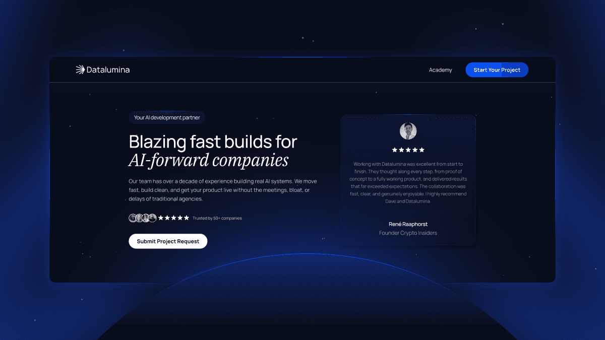
Academy Datalumina is an educational platform focused on GenAI training and freelance bootcamps for developers. The goal was to create a main academy page with subpages, structured as brand verticals, each designed to stand out through differentiated accent colors while maintaining a unified style across the entire experience.
Datalumina is Dave Ebbelaar’s main brand, and Dave’s YouTube channel has an audience of more than 250,000 people. The academy runs on its own subdomain, academy.datalumina.com, next to the main datalumina.com site.


The Challenge
The academy had two jobs: explain the training, and get developers to enroll. That called for a high-converting platform, not a course catalog, and it raised three problems the design had to solve.
One brand, several verticals. Each vertical needed its own identity, so a visitor always knows which program they’re looking at. Push the difference too far and the academy reads like a set of unrelated sites. Hold back and the verticals blur into one page. The balance sat between a professional, unified look and distinct branding for each vertical.
An audience of developers. The people reading these pages build software for a living. The layouts had to stay clean and functional, with nothing standing between the reader and the information.
Motion that keeps people reading. To keep visitors engaged, the design needed interactive effects, smooth animations and hover states. Each one had to help someone move through the page and decide, without costing usability.
The starting point was, in Dave’s words, rough ideas. There was no finished spec to execute, so turning those ideas into pages was the job.


The Solution: Interactive Design and Strategic Branding
My Role: Framer Design and Development
Plenor’s founder handled both the design and the build in Framer, so Dave’s ideas went straight into working pages instead of passing from a design file to a developer. More on who runs Plenor.
The solution came down to three decisions:
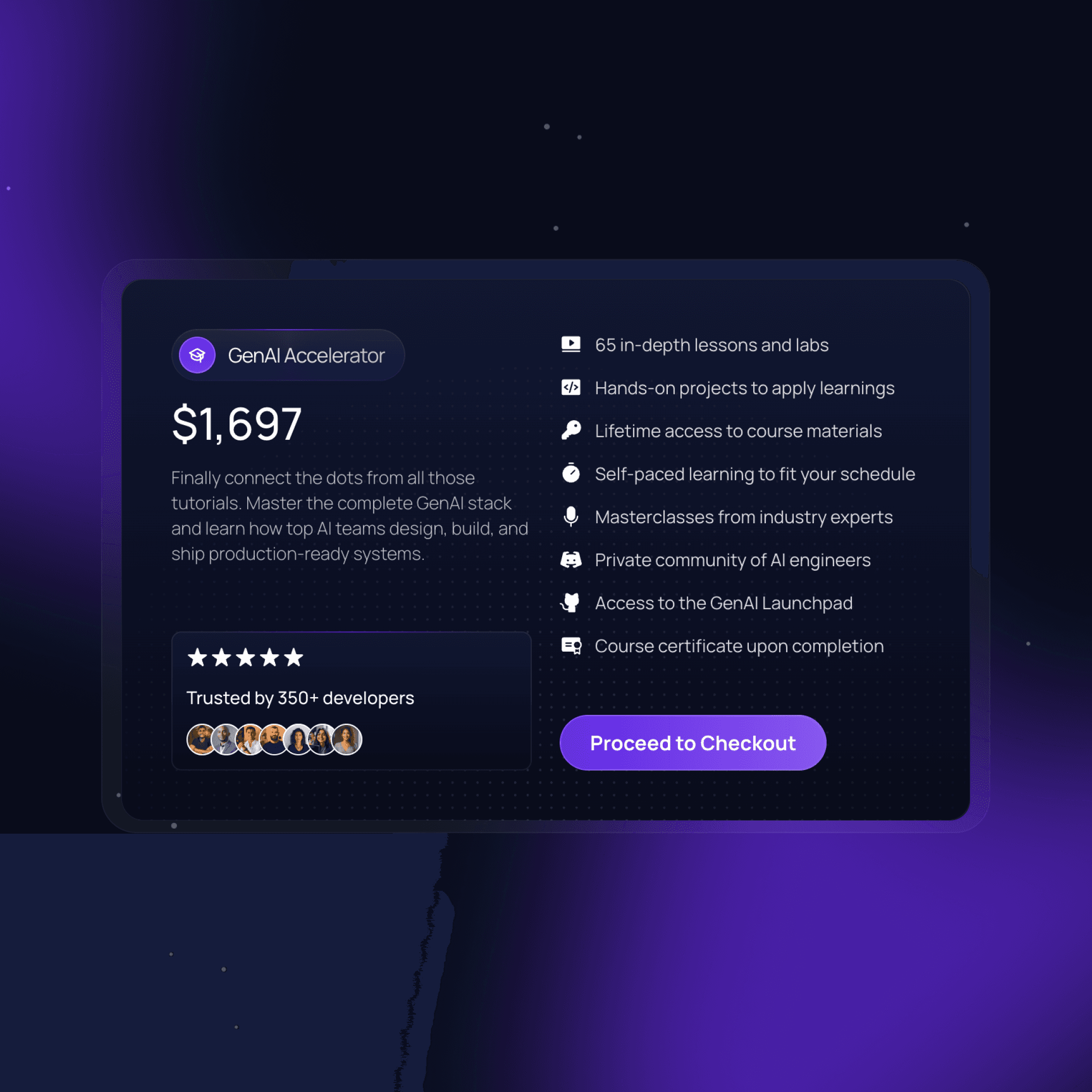
Unified Style with Differentiated Verticals. A consistent design language runs across the main academy page and its subpages. Each brand vertical gets a unique accent color, which lets it stand out while still reading as part of one identity. The accent is what changes from vertical to vertical, and the design language around it stays the same. Moving from the main academy page into a vertical never feels like landing on a different site, and the system has room for another vertical without a redesign.
High-Converting Landing Pages. The design puts conversion first. Key information is easy to find, calls to action are clear, and the layout leads visitors through the content toward enrollment. A developer deciding whether to enroll shouldn’t have to hunt for the basics, so the pages are built around that decision rather than around a list of everything the academy offers.
Interactive User Experience. To keep visitors engaged, the site carries a full layer of interaction: smooth animations on transitions, hover states that give immediate feedback, and other effects that make the learning journey more engaging. Because the same person designed and built the pages, the animations and hover states were built directly in Framer, not described in a spec for someone else to code.
Results and Impact
The Academy Datalumina website launched as an engaging, effective learning platform. Differentiated branding inside one unified style gives it a professional but lively feel. Dave’s verdict came in Slack after launch: the GenAI Accelerator page converts really well.

What shipped:
A main academy page and subpages for each brand vertical, live at academy.datalumina.com
One design language across the academy, with a distinct accent color per vertical
Animations, transitions and hover states built in Framer
Pages laid out for conversion, with clear calls to action toward enrollment
Dave’s review names the two things the project had to balance: clean, functional layouts, and custom design that makes a project stand out. Datalumina still comes back to Plenor when updates come up.
If you run training with more than one program, this is the setup worth copying: one style, one accent color per program, and pages built to get a reader from interested to enrolled.
He took our rough ideas and transformed them into stunning, professional web pages in Framer. His communication is quick and clear, making collaboration smooth and stress-free. On top of that, he’s not only great with clean and functional layouts but also delivers really cool, custom designs that make a project stand out.

Dave Ebbelaar
CEO



Not ready for a call? See what a Framer website costs, how a move to Framer works, or who runs Plenor.